The Hastings Council is seeking citizen feedback on options for its new brand logo and tagline.
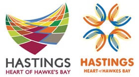 You can view the alternatives — two similar taglines, each with two graphical treatments — here on the Council website.
I’ve given advice to HDC on this matter, consisting essentially of two points:
1. Yes, “Hastings” needs an identity for marketing purposes — everything from promoting tourism to attracting economic development to building community spirit.
2. And this identity must complement and leverage the “bigger” brand that’s already significantly promoted and well-known in NZ and beyond — namely, “Hawke’s Bay”.
I’ll leave it at that. Go to the site and give the Council your reactions to the treatments, previewed below, two local firms have put forward. Or comment on this post if you prefer.
Tom Belford
Visually Option 1 wins hands down for me. I have a real problem with the tagline. If Hastings is the "Heart of Hawke's Bay" then what is Napier? The head? For me it perpetuates the silliness of separation without clebrating the distinctiveness of Hastings. What about "Hastings – part of Hawke's Bay" :)
Bluntly…what on earth does a paint companies Paint colour chart have to do with identifying Hastings??
Surely if something is needed, it would be to do with what the area is renowned for???
Perhaps we need to fast track this stupid velodrome, and have a stick man on a bicycle??
Cheers.
Wills,
Stop trying to come up with clever logos. Few of them last because they tend to bemeaningless – the best logos are the simplest and need to be used for several years to be identified with a particular product and brand.
Perhaps more time should be spent on improving the product and the logo might naturally follow.