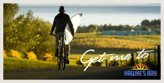
That’s the call-to-action in Hawke’s Bay Tourism’s new branding for the region, as unveiled this week.
Those who pay attention to such matters, mostly in the region’s hospitality and tourism sector, would recognize “Hawke’s Bay Wine Country” as the reigning branding for the Bay. That formulation has developed some visibility, but our new tourism team concluded most of that visibility was within Hawke’s Bay, as opposed to places outside the Bay where we should be seeking visitors. Moreover, not all segments of the Bay’s tourism sector have felt equally well-served by the ‘wine country’ identity.
The new approach features a logo that couples a fresh treatment of the Wine Country sun rising over a bold “Hawke’s Bay”.

When used in advertising, the call-to-action — Get me to — is written over the logo. This treatment can be placed over any image that depicts the Bay … from a beach photo to an Art Deco building to a tantalizing plate of food with wine.

As explained by creative architect and local resident Kim Thorp, the use of a call-to-action will have a stronger motivational impact on the viewer and, at the same time, avoids needing to try to sum up in a handful of catchy words everything the Bay is and offers.
And the added benefit is a logo treatment that any tourism biz in the region can adapt to their purposes, helping to ensure more consistency in the image of the Bay projected in their various promotions.
Chair of Hawke’s Bay Tourism George Hickton says: “We have a major task to raise the awareness and attractiveness of the region to domestic and international travellers. As a starting point we need to be consistent about the region’s brand and the way we use it in our promotional campaigns. The brand is Hawke’s Bay and we are being consistent with the new design in incorporating all the elements we have been using over the past few years … retaining the core attributes of sun and lifestyle while adding a compelling promotional message for our target markets”
Personally, I think the HB Tourism team of Thorp, Hickton and General Manager Annie Dundas nailed it. What do you think?
Tom Belford

Looks great to me. Can anyone promoting Hawke’s bay use the logo?
Finally! Something about ‘the place’; a nice clean proposition and a simple call to action.
Works OK graphically for me with enough residual link to past images. Yet, the ‘Get Me To’ perhaps needs to be artistically articulated as being ‘owned’ by HB (so as not to be confused with other generic calls such as ‘grabaseat’). That is unless it is to be used as a quasi-commercial product brand with sub-destinations such as ‘Get me to Te Awanga’ or ‘Get me to Gimblett Gravels’ or ‘Get me golfing at Kidnappers’
It is what it is, and from my viewpoint, that’s a big step forward. Well done
Works for me and the challenge is now on everyone to get behind promoting the destination. Would love to see a brand guide and usual treatments readily available to the creative sector soon…
Love it! Love it! Love it!!
George Hickton, Annie Dundas, Kim Thorp and Sam Orton – you all deserve our heartfelt thanks! Without your hard work and love of Hawkes Bay this would not have eventuated. What you have created is magnificent – the brand, the logo, the call to arms. Something we all can agree on – getting people to come to HB. Now it’s our turn to get to work – we have to get in behind and support each others tourism businesses and Hawkes Bay Tourism.
Great work….new logo looks very good. Hope Hawkes bay tourism follows this up with successful marketing……
Fabulous presentation. No doubt we are all thrilled with the direction of the team. Great to have the commitment from Mr Yule and hopefully Mrs Arnott.
Let us not forget many of our prospective visitors are average Kiwi Mum and Dad with 2 or 3 children so you will not reach them through glossy high end publications.
The flexibility of the brand is very exciting and hopefully the unity of the region will gain momentum and continue to the benefit of Hawkes Bay
A second milestone in the branding of Hawke’s Bay! (the first being 2000). Fully respecting its origins yet showing the maturity of our tourism thinking, superb & inspired. It was heartening to see this unveiled to a sector in need of some renewed passion & confidence. A massive credit to the new team at the helm of HB Tourism & the continuing wisdom of Kim Thorp.
I love the concept… the problem is Hawke's Bay has had a number of brand identifications recently… this I think is the best so far… so ask yourself when did Coca Cola last change is logo?
We need to decide what we want and stick with it.
Fruit bowl lasted a good few years…. me thinks longer than Wine Country will, because Hawke's Bay is more than just grapes and wine.
This looks great, I really like what I have seen so far. we are so lucky to have such skilled talent here in HB to get projects like this off the ground
Hi Everyone
Sorry I have been out of touch , but have been Helping others earn their income.
At the risk of upsetting Mr Tom Morgan with my Ill informend comments, I am appalled at the HB Todays attempt to attract tourists both from NZ and abroad with the latest Front page headlines
"Theft season is apon us"!!
Well done HB today , We all know this in HB , but really!! No need to inform the rest of the World.??
One hopes that Tom Morgan , being an Ex newspaper Man will support me in my condemnation of the above?.
Regards
Mike