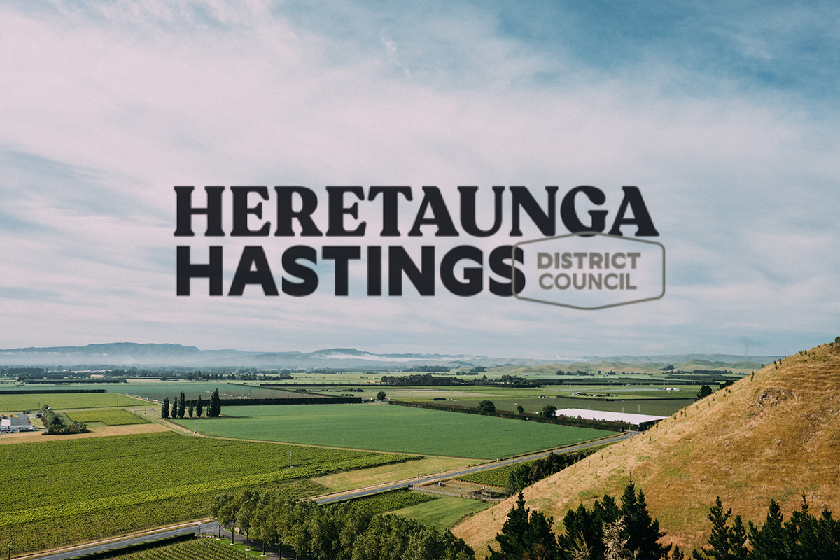
A fresh new look for Hastings is being rolled out.
The new Heretaunga Hastings brand aligns with the Hastings District Council’s Heretaunga Ararau Strategy (2020), which acknowledges the importance of using te reo Māori across Hastings District and within Hastings District Council.
Vicky Roebuck, Marketing and Brand Lead at HDC says the work on this project was completed in July 2020, well before the Cyclone. “Tenders were put out through the GTS website and with no local tenders, the Council commissioned a Strategy and Creative Agency from Wellington to design the new branding.”
This will be used to promote Hastings District across tourism and economic development activity and will also be used for HDC’s business activities.
It replaces the ‘Heart of Hawke’s Bay’ logo and Council’s main gannet-adorned logo and will gradually extend to replace another 40-plus logos that have developed over the years – many of them not obviously linked to Council. It does not replace the official name of Council, its coat of arms or official seal.
The roll-out will happen gradually, with a focus on replacing collateral such as signs and forms as they wear out or run out.
“Even before the impact of the cyclone, this project was designed to be as cost-neutral as possible,” says Hastings District Council marketing, communications and engagement group manager Naomi Fergusson. “We are very mindful that we do not waste budget by replacing items before they reach their end of life, and that we do not send waste to landfill unnecessarily.”
One of the most visible early changes will be to the ‘gateway’ signs on the outskirts of Hastings, likely to happen within the next month. The signs were scheduled to be replaced under the Heretaunga Ararau Strategy in 2020/21 but the project was delayed to align with this project. Now it is particularly timely due to some signs being damaged in the cyclone.
The other most visible changes will be to electronic assets, which can be easily changed at no cost. It will be used across all facets of Council’s day-to-day business, creating better clarity for residents and ratepayers on what services, facilities and initiatives are being provided by Council.
Public Interest Journalism funded through NZ On Air


Possibly one of the most boring local authority logos in the country that has no identifying feature of the District. Embarrassing.
Is this a place filler until the real one is unveiled?
And how much did Hastings rate payers spent on this ‘master piece’? How inspiring…..
Apart from the fact that the photo behind the logo seems to have been taken from our property, this is a seriously boring logo. Is it even a logo at all? There is no life in the artwork (I use the term artwork loosely) and no hint of Hastings at all. I’d be interested to see what they may have rejected in favour of this.
Creative Agency from Wellington? Looks like a Microsoft Word project … boring! It doesn’t reflect our region and looks like a post stamp.
I would like to think this work has been done pro bono, but fear some charlatan has already been paid for it.